Introduction
In the rapidly evolving landscape of urban development, wayfinding tools serve as critical connectors between people and places. The Changxindian Phase One Project in Beijing represents an ambitious cultural and commercial development that required an equally impressive navigation solution. This blog takes you behind the scenes with the Mapful.art team as they transformed raw architectural data into an intuitive, visually striking guide map that balances artistic expression with practical functionality.
The Client Brief: Understanding the Vision
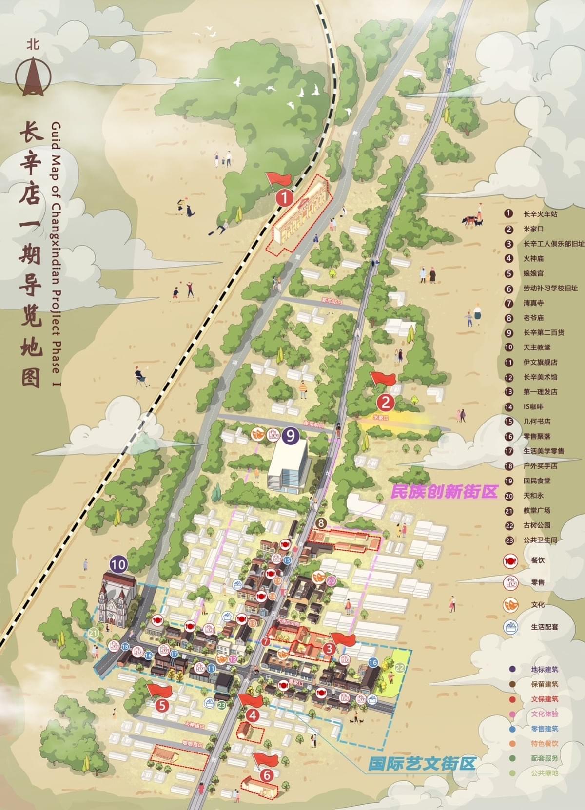
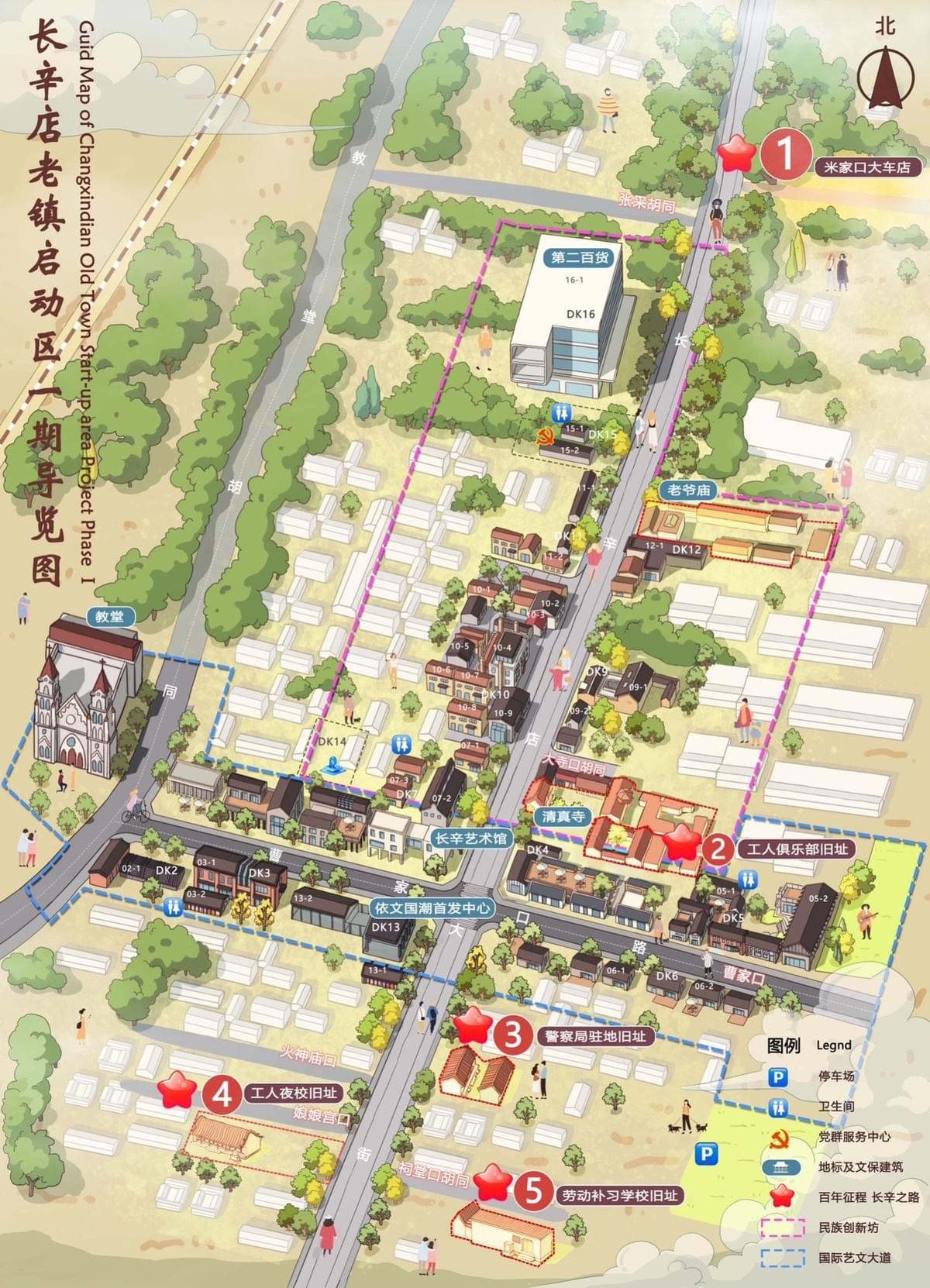
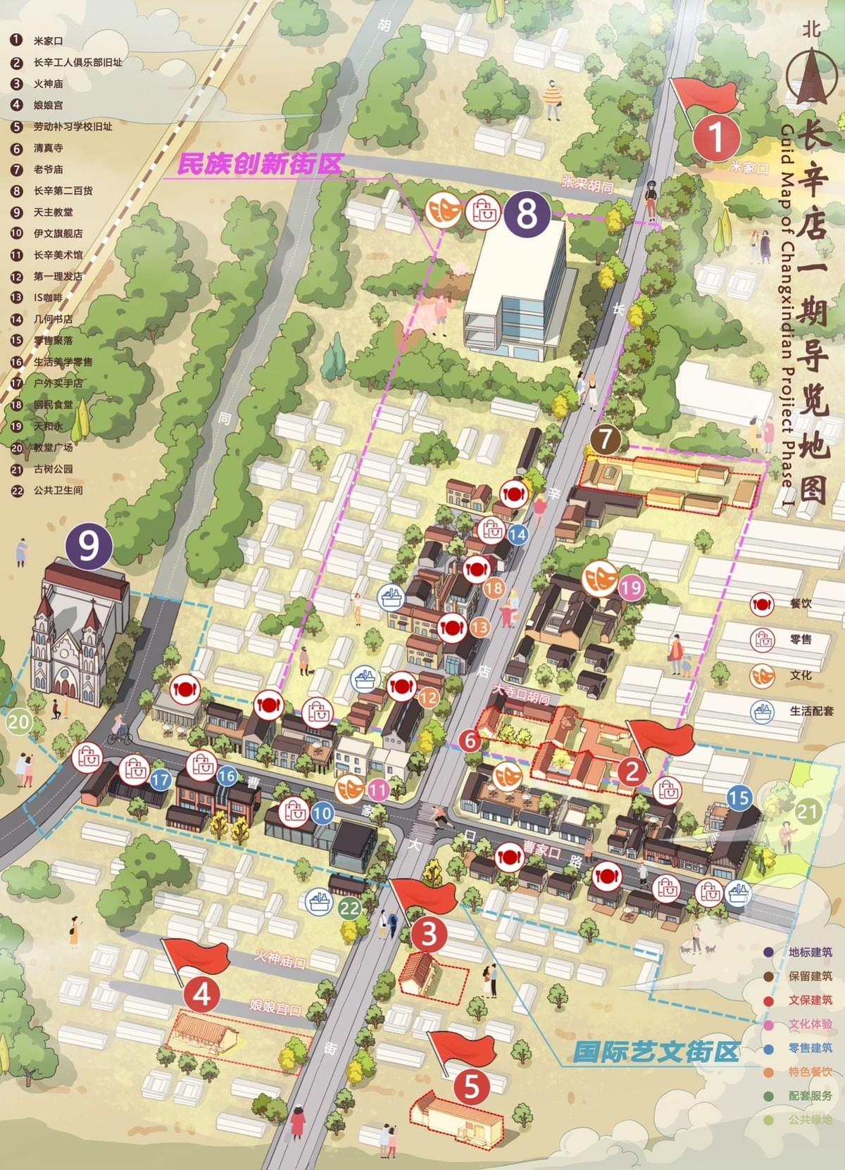
The journey began with comprehensive consultations to understand the scope and vision for this unique project. The Changxindian development features two distinct zones: the Ethnic Innovation District in the north and the International Arts and Culture District in the south. Each area possessed its own character and attractions that needed clear representation.
The primary objective was creating more than just a map—it needed to be an engaging visual storyteller that would serve multiple audiences, from first-time visitors to potential investors and tenants exploring leasing opportunities. The aesthetic direction required a delicate balance: professional enough to reflect the development's significance while approachable enough to invite exploration.
Deep Dive: Research and Data Collection
Before a single line was drawn, the Mapful.art team immersed themselves in the physical and conceptual space of Changxindian. This included:
- Walking the entire development to internalize spatial relationships
- Documenting distinctive architectural features through photography and sketches
- Acquiring and analyzing building plans and elevation drawings
- Reviewing master planning documents to understand zoning intentions
- Conducting interviews with project stakeholders to identify priority locations
- Mapping infrastructure elements from pathways to green spaces
This research phase proved invaluable, revealing not just the physical layout but the intended flow and function of different spaces within the development.
Crafting the Design Approach
Armed with comprehensive data and a clear understanding of objectives, the team developed a visual strategy that would bring the map to life:
Visual Style Guide
The team opted for a semi-realistic approach featuring:
- Three-dimensional building representations with simplified architectural details
- A soft, inviting color palette anchored by beige grounds and verdant landscaping
- Color-coded structures to differentiate between facility types
- Clean, uncluttered spaces that maintained geographical accuracy without overwhelming the viewer
Information Hierarchy System
To manage the complex layers of information, a multi-tiered approach was implemented:
- Primary landmarks identified by prominent red numbered flags (1-5)
- Secondary points of interest marked with circular numbered indicators (6-21)
- A comprehensive icon system differentiating cultural venues, dining options, and services
- Color-coding in the legend to quickly identify building functions
Navigation Elements
The team incorporated subtle but effective wayfinding components:
- Directional indicators oriented to real-world compass points
- Clearly delineated pathways with varied widths to indicate primary and secondary routes
- Strategic use of negative space to create natural visual flow
The Technical Execution: Bringing the Map to Life
With the conceptual framework established, the team moved into production through several distinct phases:
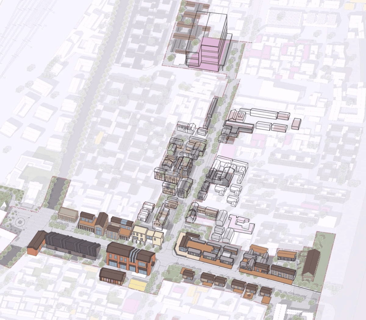
- Base Map Creation
The foundation was laid with an accurate representation of the terrain and street network, establishing the geographical framework upon which everything else would build. - Building Illustration
Each structure was carefully rendered in 3D style, with particular attention to distinctive architectural elements that would help with recognition. Historic buildings like the church-like structure at point #9 received extra detailing, while maintaining a cohesive visual language across all structures. - Environmental Elements
Trees, green spaces, and landscape features were added to soften the urban environment and reflect the actual pedestrian experience. - Implementation of the Labeling System
The previously designed numbering system and markers were applied with careful consideration for readability and visual harmony. - Visual Enhancement
Shadows, textures, and subtle depth cues were incorporated to enhance dimensional understanding without cluttering the design. - Digital Refinement
Final touches included consistent lighting effects and color harmony adjustments to ensure visual cohesion across the entire map.
Distinctive Features That Set the Map Apart
What makes the Changxindian guide map particularly effective are several specialized elements:
- Clear District Demarcation: Subtle visual cues help visitors understand when they're transitioning between the Ethnic Innovation and International Arts districts
- Comprehensive Icon System: Intuitive symbols instantly communicate facility types, bridging potential language barriers
- Multi-Level Information Access: Users can quickly identify main attractions or dive deeper into the detailed points of interest
- Balanced Representation: The map maintains correct spatial relationships while slightly emphasizing important features for better navigation
- Stylistic Gradient: Key buildings receive more detailed rendering while secondary structures appear more simplified, naturally directing attention
- Human Scale: The inclusion of small human figures provides both scale reference and brings the environment to life
From Completion to Implementation
The finalized map was optimized for multiple applications:
- Large-format versions for on-site information kiosks
- Scaled versions for printed brochures and handouts
- Digital adaptations for websites and mobile applications
Throughout development, the team ensured visual consistency with other Changxindian promotional materials, creating a seamless brand experience. The design focused on accessibility across language barriers through visual communication, and was structured to accommodate future updates as the development continues to evolve.
Conclusion
The Changxindian Phase One Project Guide Map exemplifies the art of balance in cartographic design. It successfully merges technical accuracy with artistic expression, detailed information with visual clarity, and practical functionality with aesthetic appeal.
What appears as a simple guide map to the casual observer represents countless hours of research, design iteration, and technical execution. The result is more than a wayfinding tool—it's a visual narrative that invites exploration and enhances the visitor experience at this remarkable cultural and commercial development.
The Mapful.art team's creation stands as testimony to how thoughtful cartographic design can transform space into place, turning a collection of buildings into a cohesive, navigable destination with a clear identity and purpose.