Introduction
In the world of cartographic design, functional maps that also delight the eye represent the perfect marriage of utility and artistry. The illustrated map of Nanjing South Railway Station, created by the talented team at mapful.art, exemplifies this balance beautifully. This vibrant, cartoon-style wayfinding tool not only helps travelers navigate one of China's busiest transportation hubs but does so with visual charm and character. In this post, we'll journey behind the scenes to explore the meticulous process that transformed raw geographic data into an engaging visual guide.
Understanding the Client's Vision
Every successful map begins with clear objectives. For the Nanjing South Railway Station project, the mapful.art team first established the map's core purpose: to serve as an intuitive wayfinding tool specifically for the station's Police Precinct area. This required understanding:
- Primary audience needs: Travelers and visitors requiring quick orientation in a complex space
- Essential elements: The station building, surrounding structures, police facilities, roadways, and key landmarks
- Aesthetic direction: A friendly, approachable cartoon style with clear Chinese labeling
- Functional requirements: Balancing geographic accuracy with visual simplicity
By establishing these parameters early, the design team created a foundation for all subsequent decisions, ensuring the final product would meet both practical and visual goals.
The Research Phase: Gathering Critical Data
Before a single line was drawn, extensive research laid the groundwork for accuracy and relevance:
Geographic Foundation
The team collected comprehensive base mapping data, including satellite imagery and existing maps of the station area. This established the critical spatial relationships that would underpin the illustrated version.
Field Research
Site visits likely played a crucial role, allowing the artists to experience the space firsthand—noting architectural details, understanding pedestrian flow patterns, and identifying visual landmarks that might not appear on conventional maps.
Visual Documentation
Reference photographs of key buildings captured the distinctive architectural elements that would make structures instantly recognizable, even in simplified form.
Official Information
Collaboration with station authorities ensured accurate representation of facilities, services, and proper naming conventions—particularly important for official areas like the police precinct.
Conceptualizing the Design Approach
With research complete, the design phase began by establishing the map's visual language and overall approach:
Perspective and Boundaries
The team selected a modified bird's-eye view with a slight 3D perspective—a choice that maintains geographic accuracy while allowing buildings to be shown with recognizable facades.
Feature Selection
In any illustrated map, what you leave out is as important as what you include. The team carefully curated which elements would appear, prioritizing navigational relevance over comprehensive detail.
Visual Style Development
A consistent cartoon aesthetic was developed, characterized by:
- Simplified but recognizable building representations
- A bright, welcoming color palette
- Consistent iconography for recurring features
- Whimsical elements like the police character mascots
This style strikes the perfect balance between approachability and authority—friendly enough to be engaging, yet official enough to instill confidence.
The Production Journey
The actual creation process moved from structural accuracy to artistic expression:
Base Layout Construction
Using the gathered geographic data, the team first established an accurate underlying structure with proper spatial relationships and scale.
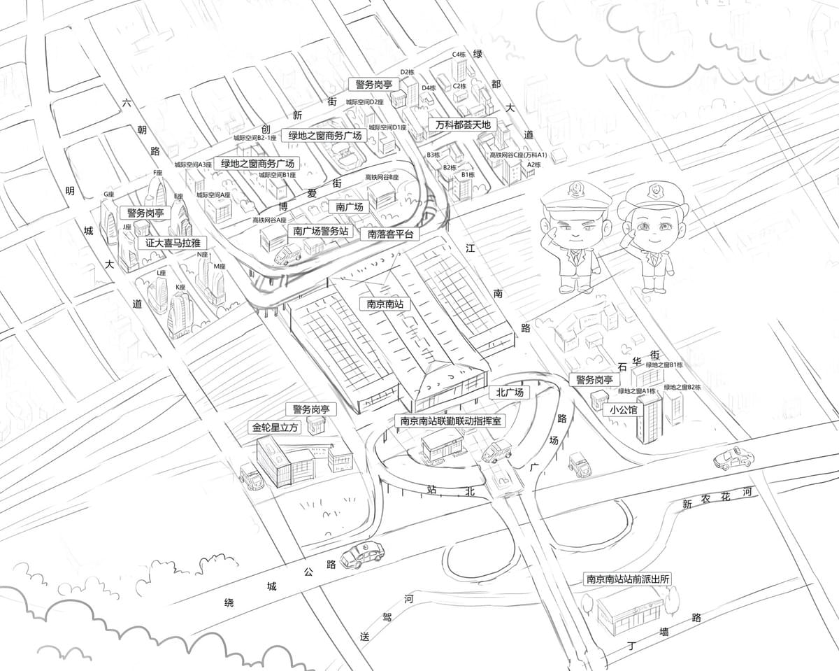
Initial Sketching
Preliminary drawings mapped out all key elements, ensuring proper placement and proportions before committing to final artwork.
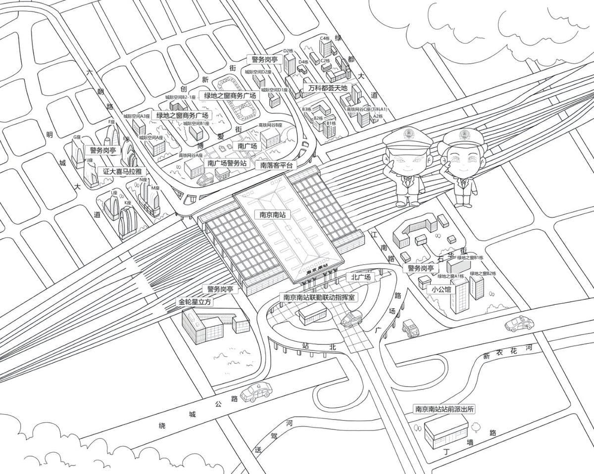
Stylistic Application
The agreed-upon cartoon aesthetic was then consistently applied to transform realistic structures into their stylized counterparts.
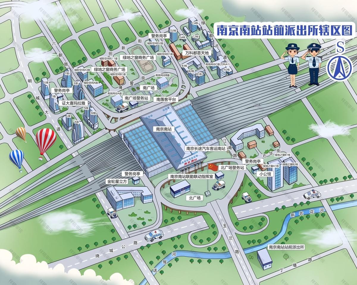
Color Implementation
A vibrant yet harmonious palette brings the map to life with:
- Refreshing greens for parks and vegetation
- Bold blues for water features and the station's distinctive roof
- Warm tans and grays defining the road network
- Thoughtfully varied building colors that aid in visual differentiation
Labeling and Wayfinding Elements
Clear Chinese text labels were added for all significant features, carefully positioned for maximum legibility without overwhelming the visual elements.
Decorative Flourishes
Final touches like the charming hot air balloons and police mascot characters add personality while reinforcing the map's official nature.
Technical Craftsmanship
Behind the artistic choices lies serious technical expertise:
Digital Tools
The map was likely created using professional vector-based design software such as Adobe Illustrator, allowing for precise control and easy scalability.
Strategic Layering
A sophisticated layering strategy organized different elements—from base geography to decorative touches—ensuring efficient workflow and easy modifications.
Color Management
Consistent color application considered both digital display and physical printing requirements, maintaining visual appeal across different media.
Typography Considerations
Text elements were carefully selected and positioned for optimal legibility while harmonizing with the overall aesthetic.
Ensuring Quality and Accuracy
Before delivery, rigorous quality control measures ensured the map's effectiveness:
Geographic Verification
All locations and spatial relationships were verified against source data to maintain navigational accuracy.
Label Checking
Chinese text elements underwent careful proofreading to prevent errors or miscommunications.
Usability Testing
The map was likely evaluated for its effectiveness in real-world scenarios, ensuring visitors could intuitively understand and navigate with it.
Client Feedback Integration
Adjustments based on stakeholder input refined the design to better meet specific needs of the police precinct and station authorities.
The Distinctive Success Factors
Several key elements make this map particularly effective:
Clear Visual Hierarchy
The central station building commands appropriate visual prominence, helping visitors establish their bearings immediately.
Balanced Simplification
Buildings retain just enough detail to be recognizable without overwhelming the viewer with unnecessary complexity.
Intuitive Organization
The clear differentiation between roads, buildings, and green spaces creates an instantly understandable visual language.
Official Character with Approachable Charm
The inclusion of police mascots cleverly communicates the map's official status while maintaining an inviting feel.
Conclusion
The Nanjing South Railway Station illustrated map represents cartographic storytelling at its finest—a seamless blend of geographic accuracy, practical utility, and visual delight. By following a methodical process from client analysis through research, design, production, and quality assurance, mapful.art has created more than just a wayfinding tool; they've crafted an engaging visual experience that transforms the potentially stressful navigation of a major transit hub into something approachable and even enjoyable.
This map stands as a testament to how thoughtful design can elevate everyday tools into something special, serving as an excellent case study for cartographers, designers, and illustrators interested in the power of visual communication to enhance public spaces.