Introduction
In the world of cartography, there exists a delicate balance between practical utility and artistic expression. When the Mapful.art team was commissioned to create a hand-drawn map for the Taihu Jiayuan Community, they embraced this challenge with enthusiasm. The result? A visually stunning yet highly functional navigational tool that captures the essence and character of this vibrant residential complex. This blog post takes you behind the scenes of how this charming community map came to life, blending artistic sensibility with practical wayfinding.
The Planning Phase: Gathering the Essentials
Before putting pen to paper (or in this case, stylus to tablet), extensive groundwork was essential. The Mapful.art team began by immersing themselves in understanding the Taihu Jiayuan community layout and its unique characteristics.
The initial research involved:
- Collecting precise locations and numbering systems for buildings 70-112
- Understanding the four distinct grid networks that would need color-coding (red, blue, yellow, and purple)
- Mapping out key roadways including Fengmao Road, Ruitai Road, and Shell District Road
- Identifying community focal points such as the Cultural Plaza and Home for the Elderly
This foundational information formed the backbone of what would eventually become not just a map, but a visual story of the community.
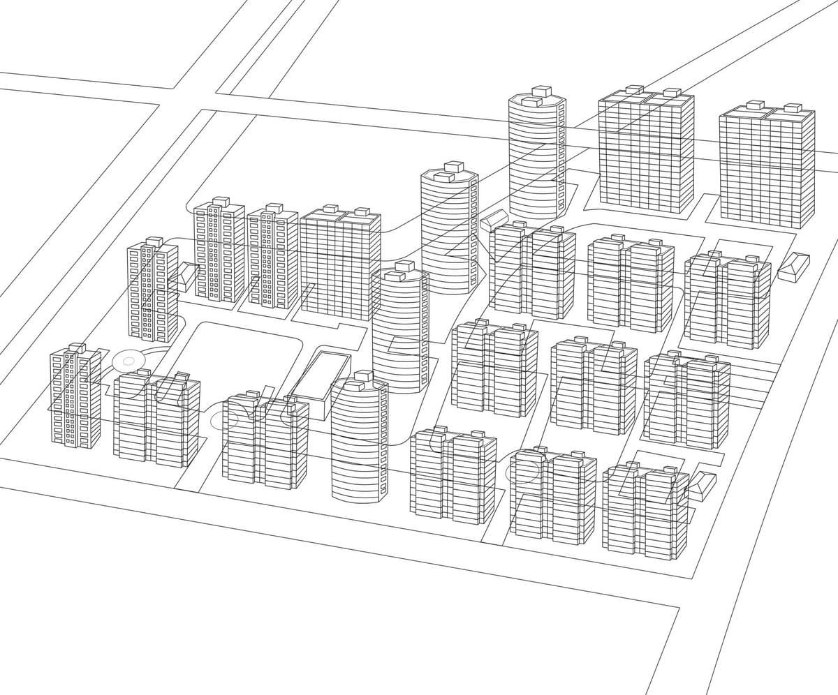
Choosing the Perfect Perspective
One of the most critical decisions in creating the Taihu Jiayuan map was selecting the right perspective. The team opted for an isometric view, which offers several advantages:
- It provides a consistent bird's-eye perspective that maintains proportional relationships between buildings
- Unlike a flat top-down map, it creates depth and dimension, making structures more recognizable
- It allows viewers to identify facades and architectural features from a consistent angle
- The 3D effect engages viewers more deeply, inviting them to explore the community visually
This perspective choice struck the perfect balance between geographical accuracy and visual engagement, creating a map that's both informative and pleasurable to view.
Infusing Artistic Elements
What transforms a functional map into a visual masterpiece is attention to artistic detail. The Mapful.art team employed several techniques to enhance both the aesthetic appeal and emotional connection to the map:
Color Palette and Visual Harmony
- Soft, pastel tones for buildings create a welcoming atmosphere while still allowing for distinction between structures
- Vibrant greens of varying shades bring landscaped areas to life
- Carefully balanced color distribution ensures no area of the map dominates visually
- Color consistency maintains a cohesive look throughout the illustration
Human Elements and Community Spirit
The addition of cartoon-style figures throughout the map serves multiple purposes:
- Provides a sense of scale for buildings and spaces
- Adds warmth and life to what could otherwise be a sterile representation
- Reflects the community-centered nature of the residential complex
- Creates points of visual interest and discovery for viewers
Environmental Detailing
- Decorative trees and landscaping reflect actual greenery while enhancing visual appeal
- Shadows and highlights create depth and dimension
- Stylized architectural elements maintain distinctiveness while fitting within the illustration style
- Small details reward close inspection, making the map engaging at different viewing distances
Practical Navigation Features
While artistic elements make the map appealing, its primary purpose remains navigation and orientation. Several features ensure the map serves this practical function:
- Clear Building Identification: Bold, prominent numbering makes locating specific buildings (70-112) straightforward
- Intuitive Color-Coding: The four grid networks are distinguished by consistent color schemes (red, blue, yellow, and purple), explained in the legend
- Road Labeling: All major thoroughfares are clearly named, with entrances and exits clearly marked
- Prominent Landmarks: Community facilities like the Cultural Plaza and Home for the Elderly receive special iconography for easy identification
- Logical Information Hierarchy: The most important navigational elements stand out through size, color, and placement
Digital Production While Maintaining a Hand-Drawn Feel
Though the map appears charmingly hand-crafted, modern digital tools were essential to its creation:
- Professional illustration software allowed for clean, consistent linework and coloring
- Digital layers enabled the team to separate and refine different elements independently
- Text placement and alignment could be perfectly adjusted for readability
- Client feedback could be incorporated with precise adjustments
- The final design remains scalable for various formats, from large community displays to printed brochures and digital applications
This digital approach preserved the warm, hand-drawn aesthetic while ensuring professional quality and reproducibility.
Conclusion: Where Function Meets Beauty
The Taihu Jiayuan Community map exemplifies what happens when cartography transcends mere functionality to become art. By thoughtfully balancing navigational clarity with visual delight, the Mapful.art team created more than just a wayfinding tool—they crafted a visual identity for the community itself.
The success of this project lies in understanding that residents and visitors don't just need to find their way; they benefit from feeling connected to their environment through beautiful representation. The map serves as both a practical guide and a celebration of place, turning the everyday act of navigation into a moment of appreciation.
For communities considering similar projects, the Taihu Jiayuan map demonstrates that with the right blend of research, artistic vision, and attention to detail, a community map can become a cherished visual asset that enhances the living experience for all who use it.
This blog post explores the creative process behind community mapping based on the Taihu Jiayuan project by Mapful.art. For more information about custom community mapping services, visit Mapful.art.