In a world dominated by digital navigation and satellite imagery, there's something uniquely captivating about hand-drawn maps. They combine precision with personality, accuracy with artistry. Mapful.Art has mastered this delicate balance, creating custom campus maps that are both functional wayfinding tools and beautiful pieces of art. Let's take a peek behind the curtain to discover how these charming cartographic creations come to life.
The Journey Begins: Client Consultation
Every Mapful.Art creation starts with understanding the client's unique vision. This crucial first step involves comprehensive discussions to capture:
- Campus specifics: Layout details, essential buildings, and distinctive architectural features that define the space
- Purpose and application: Whether for visitor orientation, marketing materials, or commemorative gifts
- Brand alignment: How the map's aesthetic should reflect the institution's identity and values
- Audience considerations: Who will use the map and how they'll interact with it
These initial conversations lay the groundwork for a map that not only looks beautiful but serves its intended purpose perfectly.
Designing with Purpose: The Mapful.Art Approach
The distinctive Mapful.Art style isn't just about looks—it's carefully crafted to enhance usability while delighting the eye.
Balancing Accuracy and Simplification
Mapful.Art's designers achieve a delicate balance by:
- Maintaining geographical accuracy for navigation
- Simplifying complex layouts for easy comprehension
- Emphasizing key pathways and buildings
- Deemphasizing less relevant details to reduce visual noise
Developing a Distinctive Visual Language
Each map features a cohesive visual style with:
- Bright, inviting color palettes (often featuring soft blues and vibrant greens)
- Charming, slightly cartoonish building representations that remain recognizable
- Consistent stylistic treatment across all elements
- Thoughtful white space to prevent overwhelming the viewer
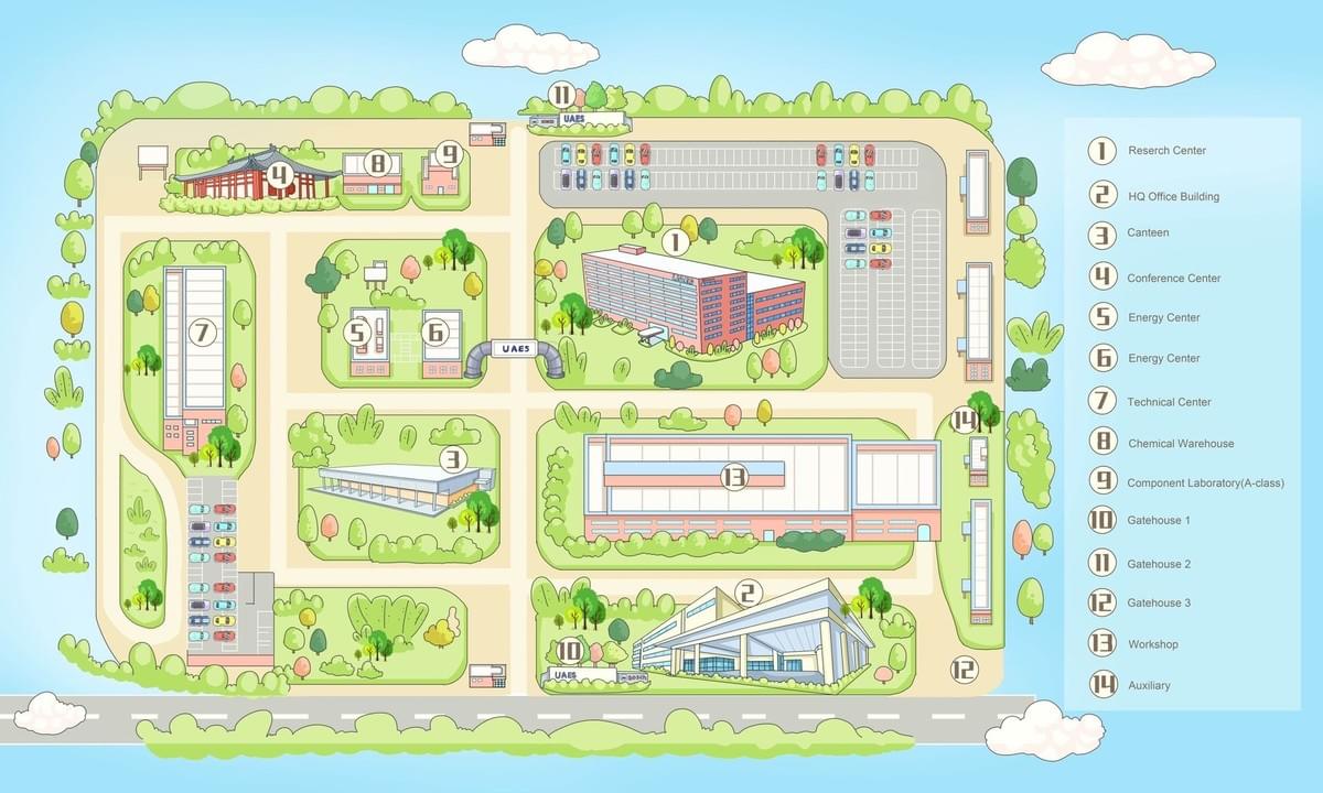
Incorporating Practical Wayfinding Elements
Function never follows form—the maps include:
- Clear numbered legends for important facilities
- Strategic color-coding to differentiate building types
- Prominently marked parking areas and road networks
- Intuitive visual hierarchies that guide the eye
Integrating Brand Identity
The final design seamlessly incorporates institutional branding through:
- Thoughtful placement of logos and identifiers
- Color schemes that align with brand guidelines
- Typography that reflects the institution's character
- Custom illustrated elements that capture the campus spirit
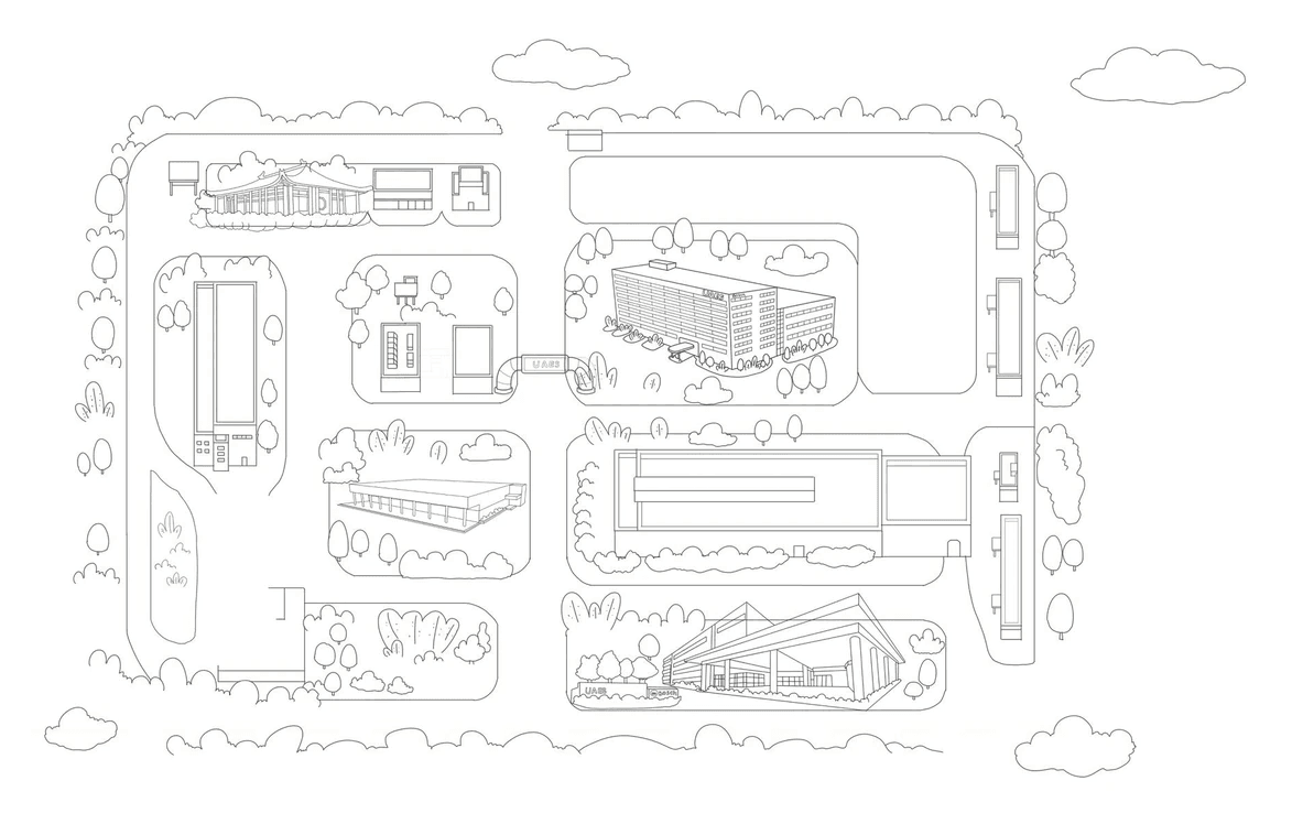
Behind the Scenes: The Technical Creation Process
Creating these bespoke maps involves a sophisticated workflow that combines traditional artistic skills with digital precision.
1. Reference Gathering
The team collects comprehensive reference materials:
- Satellite imagery for accurate spatial relationships
- Existing maps to understand established navigation patterns
- Campus photographs to capture architectural details
- Topographical information to represent elevation changes
2. Initial Design Development
With references in hand, the creative process begins:
- Creating preliminary sketches to establish layout and flow
- Developing draft concepts for client feedback
- Refining the visual style to match the institution's character
- Establishing the right balance of detail and simplicity
3. Digital Illustration
Modern tools bring the vision to life:
- Building the base map with professional design software
- Hand-drawing buildings and landmarks with digital illustration tools
- Developing unique visual treatments for different campus elements
- Creating custom icons and symbols for consistent navigation
4. Adding Character and Detail
The magic happens in the details:
- Illustrating trees, landscaping, and natural features
- Adding charming elements like tiny cars or people
- Incorporating decorative touches that reflect campus culture
- Creating texture and dimension through subtle shading
5. Finalizing Navigation Elements
Functionality remains paramount:
- Implementing clear, legible labeling
- Developing an intuitive legend system
- Ensuring pathways and roads are easily traceable
- Highlighting entry points and key destinations
6. Color Treatment and Final Touches
The finishing stages transform the map from functional to exceptional:
- Applying final color treatments for visual appeal
- Adding subtle shadows and highlights for depth
- Reviewing for accuracy and completeness
- Making refinements based on client feedback
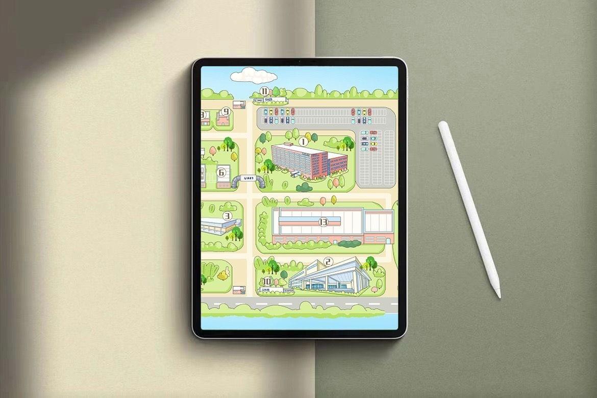
The Result: More Than Just a Map
The finished Mapful.Art creation transcends ordinary cartography. It becomes a versatile asset that:
- Guides visitors with clarity and confidence
- Serves as a marketing tool that showcases campus beauty
- Creates an emotional connection through its warm, inviting aesthetic
- Becomes a keepsake that alumni and community members treasure
These hand-drawn maps manage to be both practically useful and emotionally resonant—a rare combination in today's utilitarian world of digital navigation.
Conclusion: Where Art Meets Function
In an age of GPS and automated directions, Mapful.Art proves there's still immense value in the human touch. Their custom campus maps demonstrate how artistic interpretation can actually enhance functionality rather than detract from it.
For institutions looking to make a memorable impression, these bespoke cartographic creations offer something no satellite view or standard directory ever could: a sense of place, personality, and pride. Each map tells a story—not just of where buildings are located, but of what makes a campus special and how it feels to be part of its community.
That's the true art of Mapful's approach—creating maps that don't just show you where to go, but make you want to explore every charming corner they've so lovingly illustrated.